How Creative Coding Helps SW Developers Get Started
Data Visualization for Software Developers
#creative-coding
#design
#animation
Software engineers often need to process data or transform it into something more meaningful. Think of data-intensive applications, event-driven architectures, training models, or simply monitoring production environments. You want to understand what’s happening in your systems.
These insights often get lost unless you use the right tools to make data understandable.
Monitoring tools can help, and so do the diagrams you create every day — architecture diagrams, system-context diagrams, and more. They act as a shared language to discuss problems, explore solutions, and document systems across teams and stakeholders.
But what happens when you need to create a data visualization from scratch? Or when a client asks you to design a domain-specific visualization?
It often feels intimidating.
Common struggles you might face:
- “Visualization is hard because I don’t know where to start.”
- “Visualization isn’t my focus.”
- “I’m not a designer.”
- “I only need it occasionally.”
- “I never developed real working knowledge.”
However, you can overcome all of that.
Below are the steps to help you start with data visualization today — without becoming a designer first.
I. Understand the Purpose of Data Visualization
A long time ago, I wrote an article about Charles-Joseph Minard. He was a 19th-century civil engineer who, alongside his work, dedicated increasing time to visualizing information, refining his methods over decades.
He used visualizations to support discussions and improve communication. For him, visualizations were thinking tools — ways to express complex ideas or present facts clearly, precisely, and efficiently. He even invented several new types of visualizations.
Long before data visualization was studied scientifically, Minard already understood its power as a thinking tool.
What does this mean for modern software developers?
- Architecture, system-context or use-case diagrams give us a shared language for reasoning about systems.
- Mind maps reveal relationships and reduce cognitive load.
- When monitoring applications, dashboards surface patterns and anomalies at a glance.
Visualization helps make the invisible visible.
Alberto Cairo describes visualization as a pair of glasses: Without it, the world of data is a blur; with it, your vision becomes sharper, patterns come into focus. He also describes visualization as a language with its own grammar and structure.
One of his most important points:
“Visualization is not about simplifying, but about clarifying.”
Good visualizations illuminate reality without distorting it.
Visuals are also far more memorable than words. After a long conference day with several talks, you rarely remember every detail — but you often remember a powerful graphic or illustration that made an idea click.
Visualization is not only for your own understanding — it increasingly matters in the products you build. Consider weather forecasting: forecasters rely on charts such as inversion diagrams to detect temperature inversions and wind shear — essential for aviation weather.
➤ Data visualization helps make sense of information, reveal patterns, and communicate ideas effectively.
II. Understand Why Visual Thinking Works
To use visualization effectively and create impactful designs, it’s important to understand what visual thinking is.
Colin Ware, in his book Visual Thinking for Design, defines visual thinking as:
“A series of acts of attention driving eye movements and tuning our pattern-finding circuits. These acts of attention are called visual queries.”
This might sound abstract, but in reality, a lot happens when we look at something and try to make sense of it. The process involves how the human eye works and how information is transmitted to the brain. It’s a fast, automatic, and unconscious process that is highly tuned to recognize colors and patterns.
Ware goes into more detail on this, and once you understand the science behind how we process visual information, you can use it to create more effective visualizations. In simple terms, he connects the science of perception with the art of visualization, offering practical advice for better design.
Visualizations should be thought of as cognitive tools that enhance and extend the brain’s natural abilities. They help us process information, solve problems, and communicate more clearly by turning complex ideas into visual forms that are easier to understand.
➤ Visual thinking uses images, diagrams, and structures to process information faster, think more clearly, and communicate more effectively. By applying what we know about perception, we can make this process even quicker and more efficient.
It helps:
- among developers
- when building products for customers
- when creating creative, expressive visuals
III. Define the Concept for Your Visualization
Every good visualization starts with clarity. Ask yourself:
- What exactly do I want to visualize?
- Why am I visualizing it?
- What impact do I want — emotional, explanatory, exploratory?
- Who is the audience?
- What data do I have?
A practical workflow:
Foundational Work
Understand the goal:
What do you want to achieve? What should the audience learn or feel? What are you creating — a web app, an animation, a diagram? Focus on one aspect that resonates emotionally or within the domain. The narrative, if you use one, must be clear and easy to follow.
Formulate a strong central message around which the visualization is built.
Communicate the idea simply and effectively. Guide the audience through the topic without confusion.
Get familiar with the data:
- Which variables exist?
- How many datasets?
- What formats?
- How familiar is the audience with this data?
- What technical constraints exist?
Cleaning & Analyzing the Data
- Check for errors or missing values.
- Explore trends, patterns, outliers, min/max/average values, and use simple charts to get a first overview. (Remember: averages can distort.)
- Take notes.
- Clean the data and create basic charts to reveal first insights.
Always explain clearly how data is aggregated or presented to avoid misleading conclusions.
Sketching Designs
Create a mood board to collect visual inspirations that reflect your concept and guide your design decisions.
Then move to sketching. This helps you experiment with different design approaches.
Think about:
- What story does the data tell?
- Are unconventional forms useful?
You may sketch on paper or use digital tools. Spend time choosing the right typeface. A good font pairing enhances the design, and the color palette should match the nature of the data.
This process is iterative — just like software development.
If you are just starting out, don’t get overwhelmed by these three steps. They represent a normal project workflow. For your first experiments, keep things simple: a clear concept, your input data, and one easy goal.
IV. Experiment with AI-Assisted Creative Coding
Raw data rarely evokes emotion or insight. So what is creative coding, and how can it help?
The goal of creative coding is to create something expressive that resonates emotionally. A key characteristic of creative coding is randomness.
Many technologies can be used creatively, but some libraries and frameworks are especially well suited. Here is a method of creative coding that requires no prior knowledge of visualization libraries, dataviz best practices, or visualization design. You can begin immediately.
You need:
- your existing engineering skills
- an AI model to generate code
- a creative-coding library
- curiosity and willingness to experiment
1) Use your existing skills
You can apply well-known engineering practices: requirements engineering, asking precise questions, talking to clients, designing architecture, building iteratively, testing, deploying.
2) Use AI to generate code
You need a model you can instruct to generate code. Clear, explicit instructions help a lot (your engineering background is useful here). The model must know the context.
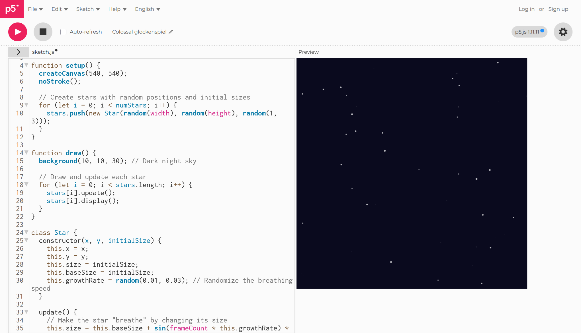
Here is an example: “Write p5.js code to draw 50 small stars at night by moonlight, scattered randomly across the canvas. Make them change size like they’re breathing. The canvas dimensions should be 540 pixels wide by 540 pixels high.”
You can use any model — ChatGPT, Claude, Gemini or others — depending on preference and budget.
3) Use p5.js as your starting library
p5.js is ideal for beginners:
- beginner-friendly
- open source
- well suited for learning purposes (less for compute-intensive tasks)
- supports randomness and noise (Perlin) (landscape, gives organic variation, generating clouds, rain…)
- perfect for animations
- immediate results via its online editor
- encourages iterative experimentation
You can find tutorials on their website and inspiring projects on OpenProcessing.
It is relatively easy to instruct AI to generate p5.js code. You can paste the generated code directly into the online editor p5.js online editor and immediately preview the animation.

If you enjoy algorithms (physics, math), you can incorporate them into your designs.
With p5.js you can:
- build shapes and patterns
- create frame-based animations
- attach input data from a CSV file (or use in combination with d3.js)
- add sound or video
- play with text and images
Most work goes into refining the result — exactly like refining software.
4) Embrace creativity and iteration
Creativity here lies not in coding itself but in formulating and refining your requirements until the result fits your intentions. You compare outcomes, iterate, and experiment — even with different models to see which one best understands p5.js or your context.
Through context engineering, you turn sketches into simple animations. You will refine them many times. Using clear design keywords helps the AI understand your style.
Enjoy the process.
Most time is spent on refinement — getting the code to do exactly what you want.
Remember: your design decisions should be deliberate, not arbitrary. Include elements that serve a purpose, but avoid overloading the final visualization. Keep things clear — for readability and accessibility.
V. Integrate & Learn More
The final step is to convert your animation into a portable format and share your source code. Or transform it into a web application or integrate it into an existing one. As a programmer, this part will feel familiar — you have many options.
If you want to go deeper, your next steps might include:
- exploring libraries similar to p5.js
- studying p5.js examples
- trying other easy-to-use frameworks that require minimal prior knowledge
- getting more serious about data visualization
A New Perspective
By now, you should feel relief:
- You can create visualizations without deep design or dataviz knowledge.
- Visualization strengthens your applications and reveals insights at first glance.
- Your work looks more professional and more polished.
A software developer does not need to become an artist to use visualization effectively.
With the right mindset and tools, you can improve understanding, communicate ideas clearly, and build visual products for clients — often more easily than expected.
➤
This post was inspired by a Future Friday workshop. More details on the creative process can be found in this portfolio project
Want to learn more about data visualization?
➤ Download my checklist 10 Steps to Amazing Data Visualizations
