Make the difference with the right design
Lessons learned while planning a hiking trip
#color
#theory
#design
Have you recently wanted to design a visualization that is clear and intuitive to use? One that answers typical questions of your users fast without having them to investigate the content for a long time? And where there is no need to explain the meaning of the symbols and how the tool works.
Even if it combines several different data types.
You have for sure, because you want to adress your customer’s problem and see it from their perspective…
Your goal is to direct your user’s attention fast to the part of the visualization that solves his task. That means, not being distracted by irrelevant elements, but straight to the point.
To do that, you can apply visually distinct elements. Those are elements that can be distinguished from their environment with ease. Does your visualization support several data types and tasks? For the most frequent or important ones, try to use elements that are even more distinct. So that your users can focus on each of them one at a time.
But what does it mean, visually distinct, and how does it look like in practice?
In this article, I’ll first give you a short explanation on what visually distinct means. On a concrete example then, we will see how to apply them and lay out a geographic map step by step for various tasks.
Visually distinct elements in design
Individual elements
Visual perception means to see and interpret our environment from the visual signals entering our eyes. Color and pattern recognition happens on a low level, and is thus a very quick process.
Representing similar aspects or related objects in the same color makes them easier to grasp. We assume that they belong together.
Our color perception is dependent on the context and contrast around a color. For objects to stand out, we can apply contrasting background colors. Or even use different lightness values.
But remember:
How we perceive colors, is very individual. Someone with visual impairment can have difficulty to distinguish certain colors or see contours. And there are cultural differences to consider, too.
Other characteristics for differentiation include size, orientation, proximity (spatial grouping) and texture. This means, to distinguish elements with ease, use different size, orientation or texture.
They are also dependent on the visual characteristics of their surroundings. Thus, a certain level of contrast is beneficial.
So if we want to make several things recognizable at the same time, we can use visually distinct elements for them. Even better if we use more than one characteristic for differentiation. It makes that element separately searchable.
But the number of separately searchable symbols is limited. So we can only solve a limited number of different queries with one visualization.
This whole distinction works well also because if we sharpen our attention to one type of difference, all the others will recede.
Related elements
Not only the entities or symbols should be well distinguishable, but also the relationships between them.
There are different ways to express relationships between elements. For instance, you can connect them with lines, enclose them by contour or having the same color background. The thickness of a connecting line can state the strength of a relation.
Let›s show this whole theory on a practical example now.
Map example for hiking trip planning
Imagine that you want to discover a region in the mountains, its richeness, rocks, flowers and animals. You have a topographic map of the Glarus Alps where you want to
➤ localize the start and end points of the tour (from Obersee to Vorauen)
➤ figure out a possible route between them
➤ estimate the total distance to run
➤ know the altitude difference in advance (whether you have the physical condition)
➤ know the highest point
➤ calculate the duration for this hiking
➤ identify possible danger zones to avoid
➤ weather conditions - you might postpone the tour if conditions are not favourable
If you were living in the middle of the19th century, you might have the famous Dufourkarte:
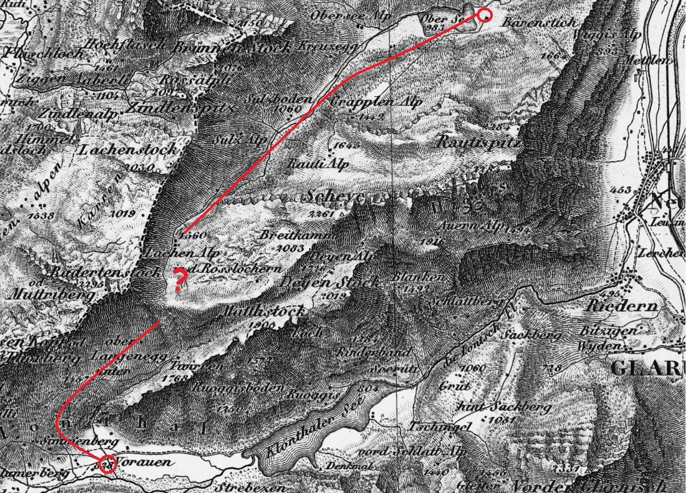
Identifying the start and end points is still the easiest task here. Although it is partially difficult to differentiate between mountain peak and village names. Topography, rivers, peaks and possible roads are recognizable. This delivers you first hints where you could find a possible route.
You heard that there is a pass on that way, but where exactly? How best to approach and pass by? There are no colors to distinguish the different elements, almost no contours. The applied different textures help recognizing meadow, sea, mountain ranges and rocky terrain. There are even some elevation values printed on it.
But looking at all your questions, you would have a hard time to plan that route accurately. Without experienced local people, your tour could very soon become an adventure. You are missing important information you prefer to know in advance.
Now jump in our time travel into the sixties of the last century. Cartography, as you can see, has evolved further.
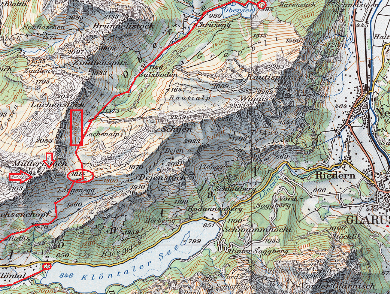
Besides different textures, colors are used to show the topography. The colors also help in estimating the altitude. There is of course a convention behind it, that you have learnt but is intuitive. Green covers lower altitudes and blue represent montagne ranges. The darker, the higher. Various patterns look like rocky areas or sloping terrains.
With colors only you have strong expression possibilities. As long as you use them wisely and sparingly.
Not only this, contour lines help a lot in knowing the altitude. They connect points of equal elevation. Along with the elevation values of some prominent peaks and places they reveal a lot on the topography. For instance, on steep terrain the lines are much closer to each other. Index contour lines are darker with their elevation printed on them.
Another evolution you can see is that there are more routes and they can be easier distinguished from their environment. Even small rivers are now much more distinct and recognizable.
How simple it becomes now to answer further questions:
➤ figure out a possible route between start and end point (routes have further developed)
➤ estimate the total distance to run (if there is a scale)
➤ know the altitude difference in advance (contour lines, elevation values)
You can make different queries on the same map, with much less effort than before. But the rest of your questions are still not or only hard to answer. Especially, how difficult those routes are? What about the weather? Total duration of the tour? Potential risks?
Nowadays, you don’t want to calculate altitude differences on your own. Neither gather all this information with tedious work from several sources.
Your next step?
As even the most recent physical map would not answer all these questions, it needs to become interactive. So that you can point on the start/end point, drawing the route between.
Today’s applications calculate the altitude difference and estimated time based on your condition. And provide you with layers showing routes for different activities. Or if a specific route is closed.
An example for route layers:
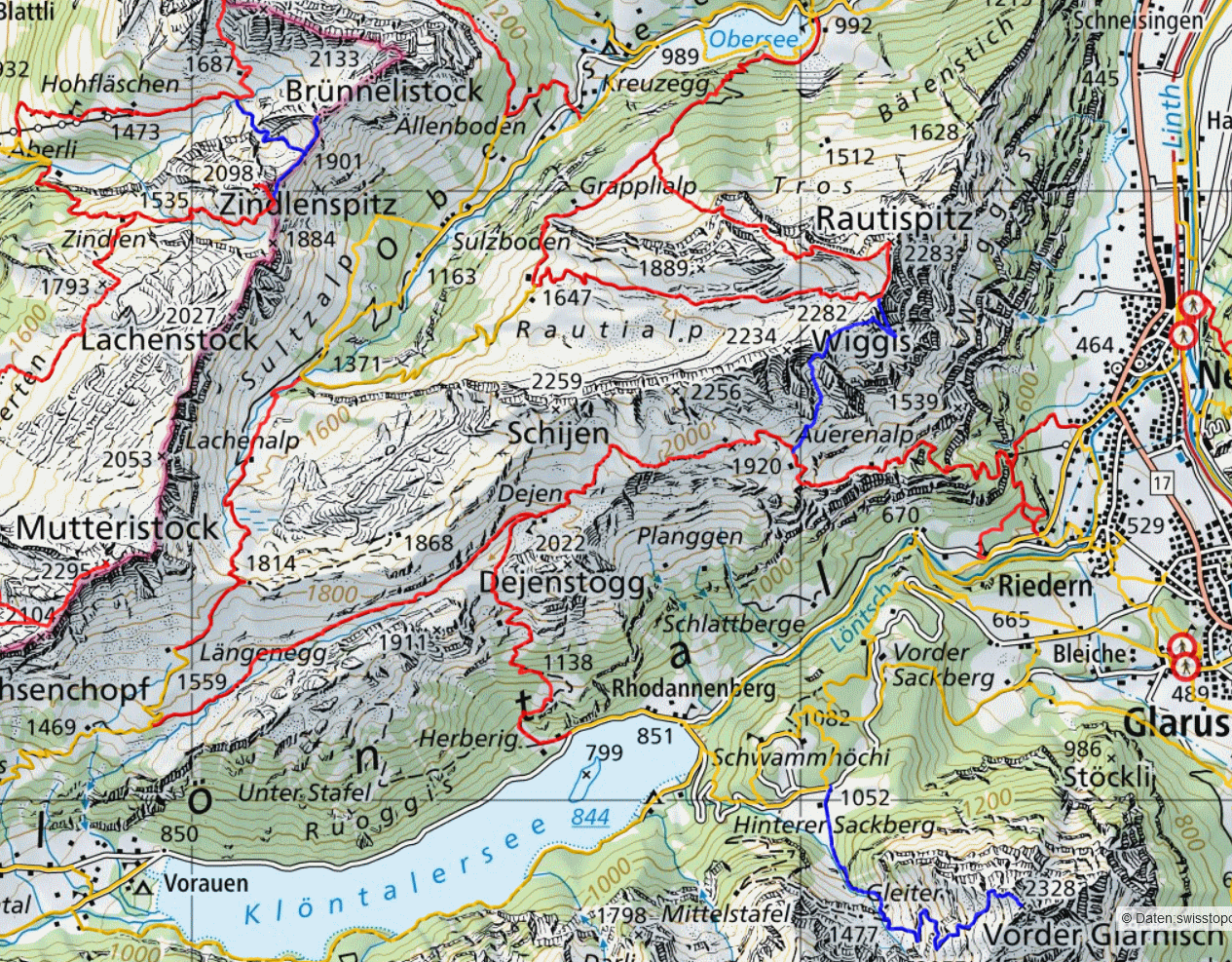
And again, to visualize the difficulty level of the routes, distinct colors will help.
According to the conventions used in Switzerland:
So you will know in advance if you have a chance to make that tour on the selected route.
More advanced applications integrating real-time data could answer all the originally asked questions.
What’s next?
The aim of this imaginary excursion was to reveal different basic design patterns and their purpose. All based on what we humans can easily percept with our eyes to support several queries.
In your next visualization, how would you control, that the results are good? It is best to ask questions that the end user will have and see if you can answer them rapidly. What needs to be changed to make it faster and more intuitive?
And of course involve the end user to figure out if there are other points to improve.
As a designer, it is helpful to know your tools, your graphical software or library well. But it is even more important to have the ability to analyze a design how good it is for solving those visual queries.
Want to learn more about data visualization?
➤ Download my checklist 10 Steps to Amazing Data Visualizations
