Building visualizations for neurodivergent audiences
Breaking limits imposed by society
#a11y
#design
People with ADHD or autism, and other neurominorities are often referred to as disabled. They are labeled with behavioral, emotional disorders, or functional deficiencies. Yet, these terms are not well-received by members of these groups, particularly autists. Instead, a more appropriate term, neurodivergent would be more favourable. It’s important to note that we’re talking about a significant part, approximately 15-20%, of the population.
The way I see it, there is only a difference in how the human brain is wired, i.e. programmed. This is what neurotypical people see as a disorder. Because those people don’t fit into the expectations of today’s society structures. Their different way of communicating, thinking and acting are seen as disability. Instead of recognized as untapped potential.
In a mathematical sense, one could say that around 80% of people are “neurotypical” or “normal”, and the rest is divergent. That is, we have a large number of similar values, and a number of outliers. Neurotypical people are closer to average. Neurodivergent people stand out with some sort of hidden intellectual capability.
At the end, it is only a question of perspective and the choice of criteria how we “group” individuals. As is still usual today, outliers are regarded with some skepsis and distance.
If you wish to talk to all those 15-20% of population, then I encourage you to continue reading. I list some tips for you here on how to make your visualizations more appealing for them.
So, what are the specific challenges that we should address in a good visualization?
Color
We use colors to categorize, differentiate information, for instance adding different series to a chart. The choice of colors poses various problems, particularly for people with visual deficiencies.
For other groups like dyslexic people there are similar rules that apply. I have taken some from the Dyslexia friendly style guide:
- Use single colour backgrounds and avoid background patterns, distracting surrounds
- This is also a good advice for other neurodivergent people
- Use sufficient contrast levels between background and text
- This is also advantageous, even a prerequisite for many visually impaired people. Unfortunately, it is not a universal rule for all
- Use dark coloured text on a light background
- White can appear too dazzling, use cream or a soft pastel colour
Too many colors can be overstimulating. Thus, prefer single-hue scales (i.e. sequential scales) over different colors. Although there is only a difference in luminance, they provide often good recognizable variations. And the benefit, your visualization will appear even more harmonic. More muted and pastel hues or neutral colors like grey have a calming effect that can be beneficial for autists as well.
Now back to the issue with the contrast level. Visually impaired or dyslexic people would appreciate higher contrast. This, at the same time can be too much for others like for many autists. This problem is also addressed in WCAG: Contrast (Minimum):
Note
Some people with cognitive disabilities require color combinations or hues that have low contrast, and therefore we allow and encourage authors to provide mechanisms to adjust the foreground and background colors of the content. Some of the combinations that could be chosen may have contrast levels that will be lower than those those specified here. This is not a violation of this Success Criterion, provided there is a mechanism that will return to the required values set out here.
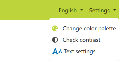
Thus, we can solve – or at least reduce - the problem by providing ways to adjust color scheme or contrast level.
The approach we can take to change the appearance of the visualization:
- Introduce user interface elements that are dedicated to adjusting color or contrast. These elements can include sliders, buttons, color pickers and similar elements.
- Sliders allow users to smoothly adjust values, such as brightness, saturation, or color hues. You can use sliders for changing background colors, text colors or transparency. You can permit users to adjust the colors of different data series or categories. For this, color pickers are also a good alternative. Have a look at what your visualization library offers to include meaningful options.
- Sometimes, it’s also a good idea to provide default color schemes or presets. Buttons or drop-down lists can be used to toggle between predefined color schemes or contrast modes. For example, you could have buttons for “Light Theme”, “Dark Theme”, or “High Contrast Mode”.
- Ensure that the new settings are reflected in the visualization in real-time. As users move sliders, select colors, or toggle themes, the visualization should immediately update to reflect their choices.
- Include options for users to save their custom color schemes or revert to default settings.

Font
The selection of the right font type can influence how well and fast people understand your design. Serif fonts – although looking professional – turn out to be not the right choice for a neurodiverse audience.
The alternative is using sans-serif fonts, i.e. fonts without extra ornaments like tails and ticks. They are preferred for their simplicity and clean lines, and also display better on computers and mobile devices.
Typical examples that are generally considered good are Arial, Verdana, Tahoma or Helvetica. Other less known examples that look great are Brother 1816, Lato or Roboto. Get inspired by William Careri’s article Designing for Neurodivergent Audiences
OpenDyslexic and Dyslexie are fonts designed specifically for people with dyslexia. However, their effectiveness has not been scientifically proven.
The Dyslexia friendly style guide also notes that font size should be 12-14 point or equivalent. They also recommend using bold for emphasis rather than underlining or italics.
Try to maintain a consistent typeface throughout your visualization or explanatory text. This reduces cognitive load and sensory stress for neurodivergent individuals. Avoid using multiple fonts to maintain visual consistency.
Navigation
A logical structure and clear navigation is fundamental.
If there is a web page, it’s purpose must be clear. On the page or in your visualization, choose a design that is intuitive and looks familiar to the majority of potential users. Remain consistent and do not change the navigation or design themes every other day.
Why is this important?
For autistic people it is essential to position elements consistently. They can then focus on the actual content and not on finding things. They might feel confused by dynamically changing content with random messages or advertisements.
Animations and videos that play automatically or movements can be very distracting and the sounds alarming. This is why I would not recommend sonification for everyone. Although an interesting alternative for visually impaired people.
Keep informing your users where they are, where they came from and what are their next possible steps. A clear path to follow is essential. Otherwise it is easy to overlook important parts and finding information becomes a tedious task.
Always orient your users within the dataset, too. It is also essential to inform them about the methods they can use to navigate within a graph.
A last note
It can be very confusing if
- several paths lead to the same target or
- same link shows up many times using different names
To final clean up your visualization, have a critical look at it and consider what data can be discarded safely. Data that brings no extra value to the context or not needed at that level of detail.
How to continue?
As with visually impaired people, it is worth considering an accessibility first design. Have these various requirements in mind from the beginning. Work together with people whose brain is differently wired. To learn from them and to understand their real problems. So that you can benefit from their experience as well, to design the best possible visualization.
Want to learn more about data visualization?
➤ Download my checklist 10 Steps to Amazing Data Visualizations
