Better visualizations through accessibility first design
Obstacles and challenges on your accessibility journey
#a11y
#design
As a web developer you can design better data visualizations, if you understand your users’ specific needs.
Creating a visualization without accessibility in mind is forgetting about a significant part of your audience. You can prevent their frustration by using an accessibility-first approach. And setting on a well designed , clear user interface.
This article will give you practical tips on how to incorporate accessibility requirements in your design. Applying them, all your customers will enjoy a more delightful experience.
Challenges for the visually impaired
Data accessibility is a very broad topic.
There is a wide range of different disabilities or impairments. Blindness, visual impairment, motoric or cognitive difficulties are a few examples. Neurodivergence also poses various challenges that we should address in a good visualization.
In this article, I’m focusing on the visual experience of people with visual impairement.
To make a usable data experience for them, your graphics have to pass various visual compliance tests. But to make that experience actually useful, is even more challenging. Here are a few tips on how solve it.
Colors - reduce to the essentials
Many questions revolve around colors and their combinations. And how to make sure that there is enough contrast between elements such as a text and its backround.
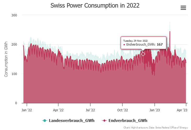
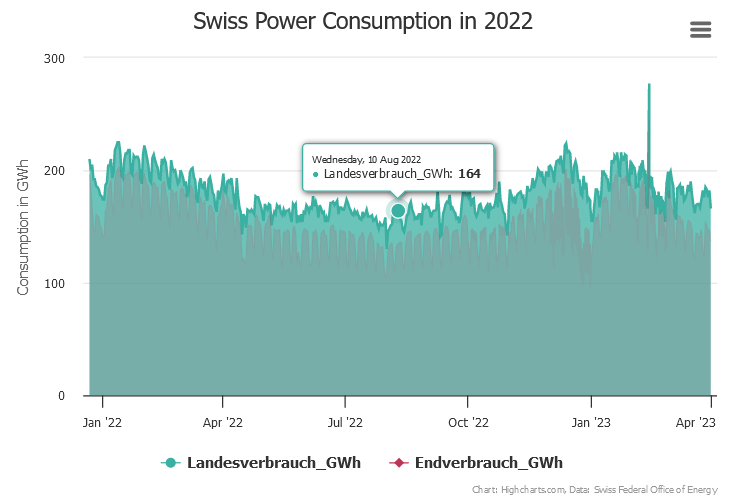
On a chart or a map, you can use more vivid fill colors to emphasize parts of particular interest. Applying a darker border between areas, filling less important parts with a lighter color strenghtens the effect. It drives your attention to where emphasis should be. A balanced use of fills and borders can improve visual search.


Another way to improve focus is to use low contrast where it doesn’t matter and apply higher contrast only to emphasize importance of elements. This contrast can be achieved by using complementary colors or enough luminance differences.
For text elements, there should be enough contrast between text and its background, so that they remain lisible. To meet accessibility standards, you can check for your contrast ratio by using a color contrast tool.
There are also many tools that help you to generate sequential, diverging or qualitative color palettes. Several of them offer to check for the most common color deficiencies. They generate harmonic colors that work well together and keep the global appearance calm and cleaned up. This is also beneficial for the rest of your audience.
I have listed such essential tools in my previous articles about colors. See «Why colors in your data visualization matter», «Color fundamentals revisited». Feel free to try them out.
Another method is to apply color for important data only and grey for less important elements. Grey is great to show non-selected, non-relevant parts or to make your visualization appear more harmonic. Use as few colours as possible, but if needed, always check your palette for color deficiency.
For further clean up of your visualization, have a critical look at it and consider what data can be discarded safely. Data that brings no extra value to the context or is confusing or not needed at that level of detail. Always display an accessible complexity of details. This is also beneficial for all other people.
Use a clear navigation
Where it makes sense, define alternative keys or shortcuts in your charts or graphs. This is also important for a good screen reader experience. Always orient your users within the dataset. Where they are, where they came from and their next possible steps. The principle of a clear navigation is not only valid for people using assistive technologies. It is also beneficial for people without any vision deficiencies. Having a good overview, a clear navigation can speed up the user’s work massively.
Navigation is possible even within the chart itself. If your chosen chart library supports, you can navigate between data points and data series intuitively using the arrow keys.
In case of a large complex graph, you might want to consider first selecting subgroups. And then going deeper, rotating the chart, zooming in/out to find the entry point. It is also practicable to add a search functionality for nodes to find them fast. But it is essential to inform your users about the methods they can use to navigate within the graph.
Consider alternatives
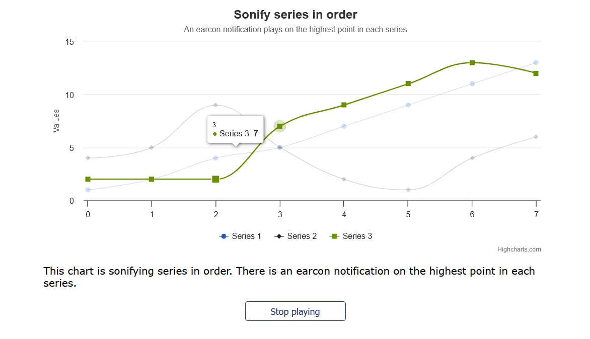
Sonification can be a complementary technique for representing data. You can see it as the auditory equivalent of /or at least as an alternative to/ pure data visualization. It uses musical tones to illustrate the size of a value. The higher the value, the higher the sound. There can also be accented sounds carrying further specific information.
Sonification can be much more visceral than visualization alone. It can be an optional feature offered to your users. Why optional? Because it is difficult to convey the exact value of a data point. There can also be end users for whom sound can be very distracting and contraproductive. But for more artistic data visualization it is a valid option to explore.

Lessons learned
Consider accessibility first to get the best possible design
It is much easier to meet compliance when you try to incorporate that work from the beginning. It also allows to produce more useful graphics. That is beneficial for everyone. Trying to retrofit those requirements to existing charts is much more painful.
Thus, first think about the use case, what the visualization should do, how it should behave in different scenarios. Formulate those expectations as specifications (i.e. test cases in software engineering). You can even think of accessibility requirements as test cases for visualizations. If you have this in mind from the beginning, it will result in a more clear and usable design. You also sort out possible issues that might arise later.
Build a diverse team and work with people who use assistive technology
It indeed changes one’s approach to graphical design. Also using assistive technology to test your assumptions.
The best testers are users who use screen readers on a daily basis or who have color deficiencies. They can point out weak or unusable parts of your visualization with ease. Their own experience is invaluable for people who don’t have those difficulties. Conversations with them can give you insights you would not gain otherwise.
And now?
You might face a lot of challenges when trying to incorporate the right thinking and build the necessary empathy in your own company.
There is still a lack of understanding why thinking about a11y is important. Even if legal obligations apply in your country, this does not change from one day to the next how people think.
Typical excuses sound like:
- the application is only used internally, we have no blind users
- the effort is too big, we have more important features to build
- we have deadlines, there is no time left for this
- we don’t have the expertise
They have one thing in common: it is all about we and me. Now it is time to change that perspective from me to you. So how would you approach this topic now?
Want to learn more about data visualization?
➤ Download my checklist 10 Steps to Amazing Data Visualizations
