Color fundamentals revisited
Navigating thru design practices and color schemes
#color
#theory
#design
Software developers working on data visualizations generally focus on the technical aspects. They ask questions on how to best visualize their data:
- What / where are my data sources
- In which format are they delivered
- API concept
- Framework / libraries to use
- General GUI layout
They don’t usually care about the very reasons why a chart needs to get created. They often rely on the default appearance given by the graphical library of their choice.
This poses two problems:
- Not thinking about the audience’s typical use cases. What are the most and least important out of them that they want to have. This leads to a generic solution that doesn’t aid in finding the most relevant informations fast.
- Color scheme might look fine for the developer, but less appealing or even unusable for an end user with color deficiency. There is no guarantee that a visualization library delivers color safe combinations.
In this article I will discuss some design fundamentals that can help you in achieving a clear, intuitive visualization. Concentrating on the color problematic, you will discover how to choose and apply them.
There exist several sites where you can build or test sequential and diverging color scales. They also allow to check for different grades of color deficiency.
Color basics
One of the most important issues is with color contrast. Appropriate contrast between an item and its surroundings can make it appear more distinct, in case of text more readable. This works because the human eye can determine light differences better than to estimate the amount of it.
It is also excellent to use pure colors like black, white, red, green, yellow and blue for items we want to distinguish from each other. As long as the combination of them remains color safe.
If there is a need to show fine details, it is better to choose colors between black and white. Using grey nuances we can convey more details than what we would be able by using other colors. We are also more sensitive to dark grey differences than to light grey differences.
More saturated colors are more pure colors, using a minimal spektrum of wavelength. Maximum saturation can vary with luminance. Too dark or too light colors appear less saturated.
Which word usage is when adequate, can be confusing. Luminance refers to the physical amount of light that we can measure. We talk about lightness when discussing surface colors. Brightness is used when we mean emitted light.
Searching for a specific color in a graphics depends on how many other colors there are in the environment. So colors cannot be treated in isolation. Their appearance is always affected by the surrounding colors.
Design essentials
How do we best show details? As mentioned above, it can be achieved with grey combinations. But with an adequate luminance contrast. For larger items, we need less contrast than for smaller items. Showing a small blue text on a black background is not a good idea. There is insufficient luminance contrast.

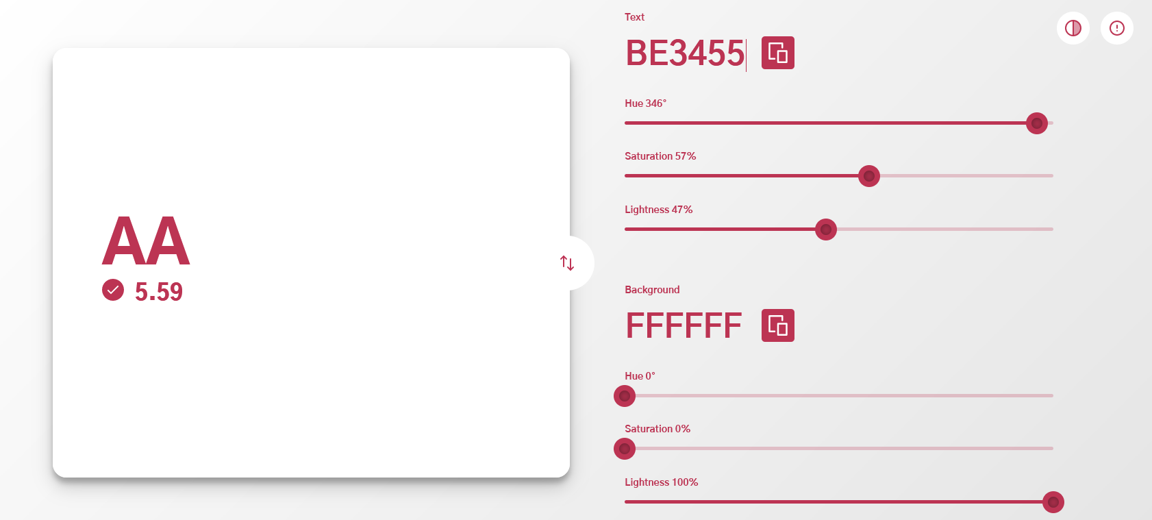
The recommendation is having a contrast ratio of at least 4.5:1 between a text and its background. For large-scale text, it is at least 3:1. Inactive or useless parts of a user interface might – and should - have less contrast.
It is worth referencing the following note from the WCAG Docs (WCAG 2.2 is planned to be published in August 2023):
Some people with cognitive disabilities require color combinations or hues that have low contrast, and therefore we allow and encourage authors to provide mechanisms to adjust the foreground and background colors of the content. Some of the combinations that could be chosen may have contrast levels that will be lower than those those specified here. This is not a violation of this Success Criterion, provided there is a mechanism that will return to the required values set out here.
Very often, color indicates different categories of information. There are two primary considerations for color selection:
- Visual distinctness to support visual search operations
- Learnability, so that particular colors are associated with particular meanings
It is worth using the unique hues first (red, green, yellow, blue, …) and then others that have relatively consistent names.
Use only a limited number of colors to keep overview and readibility. Background and direct environment can influence or distort the appearance of an individual color.
When we are looking for an object in a particular color, we can focus on that color turning our neurons to be more sensitive to that hue. This functions to a limited extent, until there are not too much distracting elements or colors around.
If we want small areas to stand out better, they should be stronger colored and have a proper luminance contrast wih larger background areas. Using low-saturation colors for large areas is desirable. Otherwise, small objects become less salient.
You can also emphasize a text or object by reducing the contrast what other elements have to their respective surroundings.
Especially in case of maps, over the course of time, some color sequences have been established. We understand how reliefs, valleys etc. are encoded. In this case it is better not to propose an alternative.
You can also limit the usage of colors to places where you want to emphasize some elements. Often, you can use grey for less important elements. Or apply color only for important areas where you want your users’ attention focused. Grey is excellent to show currently non-relevant parts of your visualization.
You might have heard about the 60-30-10 rule, used in different design areas, including UX/UI. It says that the primary color should be used for 60% in your design and the secondary color should take up 30%. The remaining 10% is for an accent color. The primary color is supposed to be a more neutral color, the secondary complementing it. The accent color is used for the rest.
With this in mind, you can achieve a simple, well balanced and harmonic design. This cannot be of course applied to every chart, but points you to the essence. “Use as few colors as you can” to stay clear.
When representing higher or lower values in a heatmap, you can use increasingly saturated values for higher values. Thus still remaining with the same hue.
The most common and important queries should have more weight. Use the most distinctive hues for the most often accessed symbols and patterns.
And it is also important to remember the semantics of color. The meaning of a particular color can be culturally determined. Knowing your target audience can help identifying points where you have to pay attention.
Color schemes
If color harmony defines as choosing colors on a color wheel that work well together, then it poses two questions:
- What is a color wheel?
- What does it mean «work well together»?
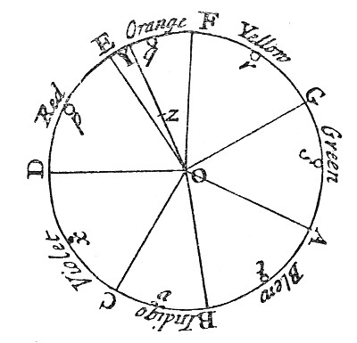
In a color wheel, the colors are organized in a circle acccording to their wavelenghts in the color spektrum. It allows to visualize the relationship of color hues. Isaac Newton is credited with creating the color wheel. Since then the concept has evolved further. Now it helps us to find «harmonious» color combinations.

In essence there are two spaces for building color wheels. The first one is the red-yellow-blue color space, used most by artists. The second one is the red-green-blue color space used for example by computers.
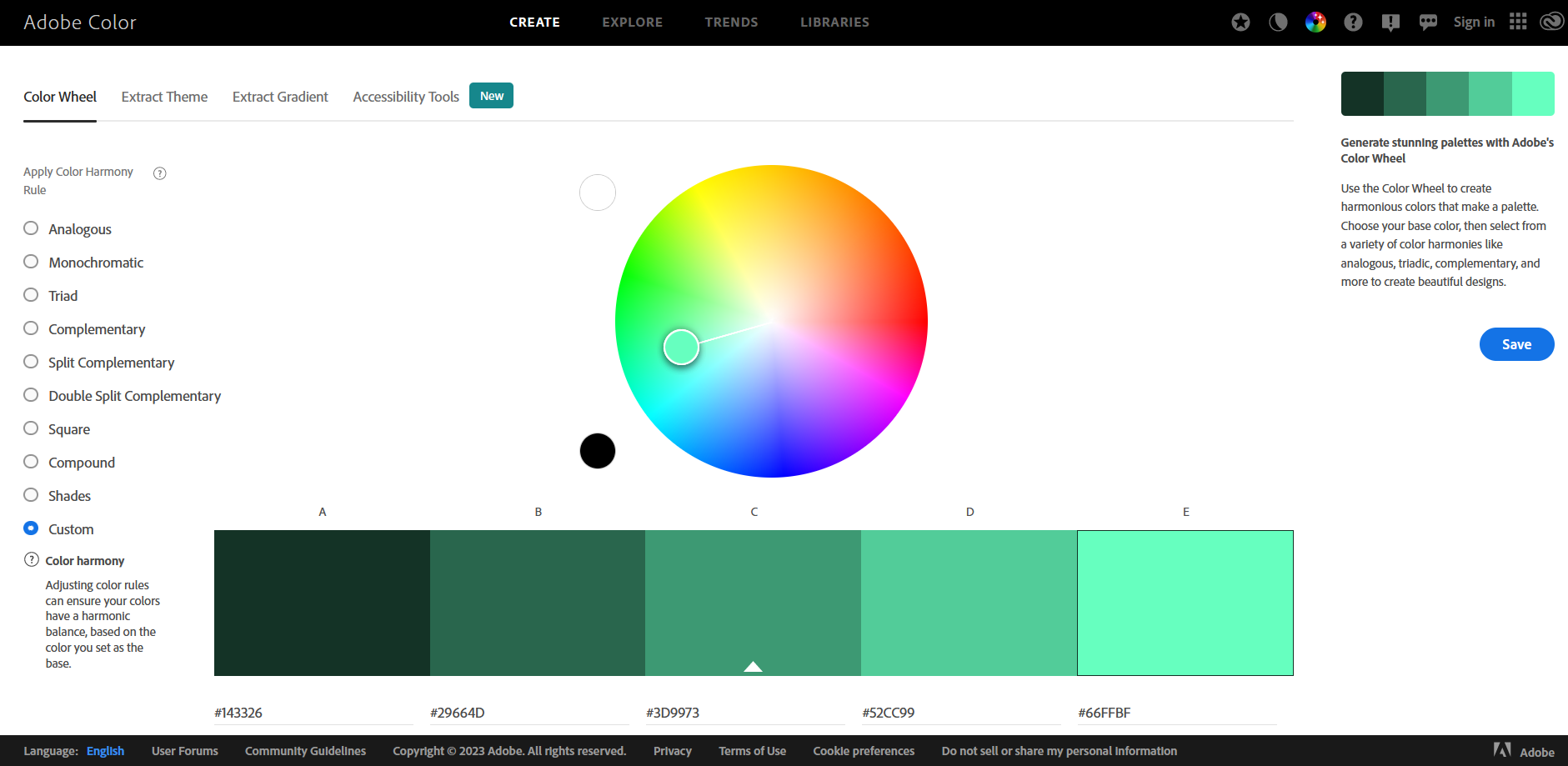
In a monochromatic color scheme there is only one hue used. Then, various tints and shades of it are used to create different variants of it. They all reside on one straight line from the center to the outside border.
With complementary colors we refer to two colors that oppose each other on the color wheel. The result of using them delivers high contrast.
How to create a sequential or diverging color scale from any chosen color?
For a sequential color scheme, one can use the monochromatic color harmony. Another example is to choose a specific hue and then continuously change luminosity to generate subsequent colors.
For a diverging color scheme one would merge two sequential color schemes with a shared midpoint. The two color schemes built from two complementary colors.
In a process of choosing the right color scheme, one needs to decide upon its purpose. Whether using it for categorization or representing a range of continuous values as an example. Knowing your data will help you to select the right scheme type.
Then you can build your color scheme. There are several tools available that generate that for you. Afterwards, the resulting sequence needs to be checked for color deficiency and contrast. If those tests pass, you are ready to use your color scheme in your visualization.

What is a color deficiency?
Humans have three types of receptors (cones). Each one is sensitive to a different part of the visual spektrum. So there are 3 types of cones that can go wrong. We distinguish among the following deficiencies:
- Protanopia – red cone deficiency
- Deuteranopia – green code deficiency
- Tritanopia – blue cone deficiency
Using software to simulate these deficiencies can help to choose color-safe combinations.
For creating sequences, you can use Color Adobe. It has also an option to test for deficiency and contrast.
Viz Palette is another tool to help you with color palettes.
A site for contrast checks: Color Shark
If you want to learn more about color and contrast on a well concepted site, visit Color and Contrast
There is also a color blindness simulator to test for color deficiency: Color Blindness
Another site for information on color blindness: Color Blind Awareness
In a previous article on “Why colors in data visualizations matter?” I listed some more resources for generating sequences or checking for contrast.
Next steps
I hope these essential tips in data visualization makes you more confident in designing your next solution. If you apply these practices from the beginning of the project, you will get used to them fast and they will become natural.
Experimenting and practicing is the best way to learn more.
Want to learn more about data visualization?
➤ Download my checklist 10 Steps to Amazing Data Visualizations
