
Visualizing data – une longue histoire?
A quick journey through the centuries
#history
#innovation
Today, large amounts of complex data surround us. Yet, we need to understand and analyze it in some way to take well-founded decisions. We try to view it from different perspectives. Or search for the best representation to make it more clear.
As our ancestors realized a long time ago, using some visual forms or graphics facilitates thinking and analyzing.
But when did it begin, and how? What motivated former engineers, scientists and thinking humans in early days? What were the circumstances and scientific problems they aimed to solve? Did they influence each others’ work and built upon existing knowledge and experience?
In this article I will take you on a journey through the centuries and mention some of the most influencial representants of their time.
You might ask, after all this evolution, which problems remain or loose importance? Will there be new directions in the future we can’t dream of yet?
Let’s make one step after the other now.
Early days
Geographical illustrations like maps belong to the oldest visualization forms. They evolved during the last centuries - and even thousands of years - all over the world. These maps served as indispensable means for orientation and navigation. Both on land and sea.
Later, the graphical expression of numbers and their relations gained importance. We can represent numbers such as distance, weight or temperature by length. Or show equations in a graphical 2-dimensional coordinate system, one value dependent on another.
Representants of this idea were among others Nicole Oresme, Pierre de Fermat and Descartes. This led to the fondation of analytic geometry.
Then, the empirical thinking came up in science and philosophy. The collection and representation of relevant quantitative data has been more emphasized.
An important known milestone in this regard is the work of Michael Florent van Langren. He was a descendant from a family of globe-makers.
At his time, several questions were revolving around how to accurately measure time or distance. The latter being an important subject in the navigation on sea. One of the concerns was the correct calculation of longitude differences between two locations.
His presentation of the problem is known today as the first visual representation of statistical data (i.e. quantitative data):

On this 1-dimensional graph, he depicted empirical distributions of data. So trying to determine the longitude difference between Toledo and Rome. His goal was to show the large range of differences, uncertainties in observations. Even if this does not solve the original problem, it is a first example of statistical visualization, far ahead of its time.
Inventing new graphical forms
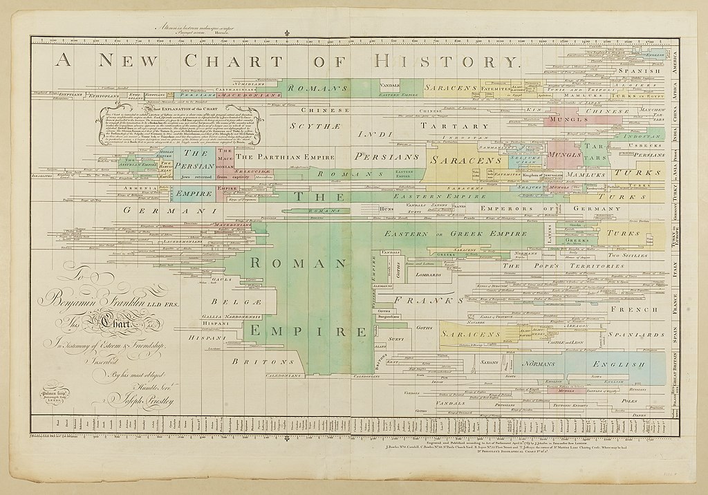
The first timeline charts came from Joseph Priestley. His motivation? Creating some accompanying material for his lectures for illustrative purposes and better understanding. The first chart named A Chart of Biography came in 1765. He used bars to represent the life span of a person. This made it possible to compare those of different persons. In 1769 he published A New Chart of History, listing events in 106 separate locations, enabling a direct comparison:
Priestley’s timelines might have inspired Wiliam Playfair. His Commercial and Political Atlas, published in 1786, contained 43 time-series line graphs and one bar chart. They summarized trade data between England and other countries, and also economic data.
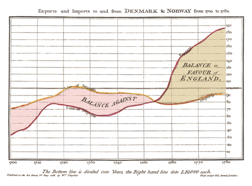
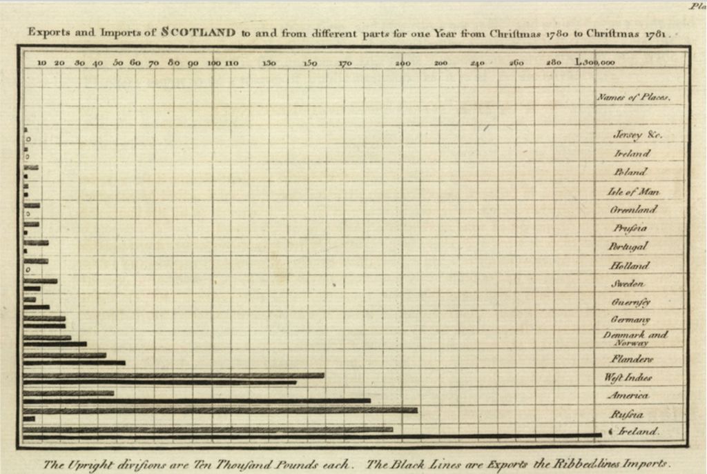
He introduced the bar chart due to lack of data. As he was unable to draw a continuous line graph, he used this – at that time – unusual form of representation. To represent data as a series of bars might have earlier sources in a publication of Jacobus de Sancto Martino, attributed to Nicole Oresme. But Playfair used them to generate a chart of discrete measurements.
Among of his several publications we can find Lineal Arithmetic (1798) or the Statistical Breviary (1801).
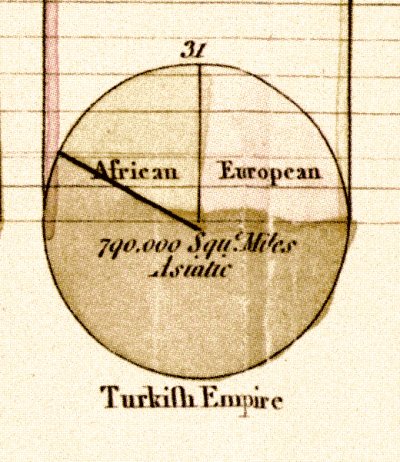
Very likely Playfair invented the pie chart as well, representing a whole-part relationship. It probably appeared first in Statistical Breviary, in London in 1801.
From 1809 until 1811, he published the British family antiquity: illustrative of the origin and progress of the rank, honours, and personal merit of the nobility of the United Kingdom: accompanied with an elegant set of chronological charts. in a limited edition.
A few years later, in 1826, Charles Dupin prepared a choropleth map of basic education in France. He used the intensity of shading to illustrate the differences between the departments. This visual representation propagated with rapid success in the following years.
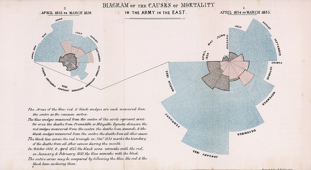
André-Michel Guerry was a French lawyer and amateur statistician. In 1829 he applied a new concept in his diagrams that he called «courbes circulaires». He explored the relationship between weather phenomena over calendar cycles and hospitalizations / mortality. For this purpose he developed what we call today polar area diagrams.
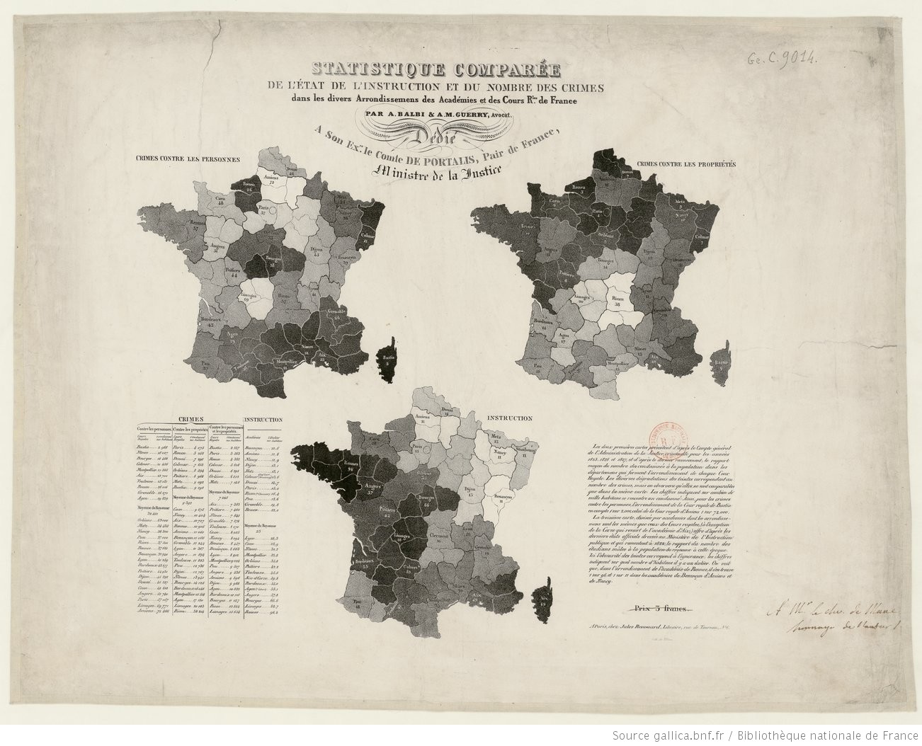
Guerry also developed the idea of moral statistics and paved the way to modern social science.
His atlas named as Statistique comparée de l’état de l’instruction et du nombre de crimes , in collaboration with Adriano Balbi appeared in 1829. It contains three maps of France, showing the crimes committed against property, persons and the level of education. He aimed to examine if there is a relation between education and number of committed crimes. This led in fact to surprising results.
The Golden Age
The rapid evolution of visualization continued during the 2nd half of the 19th century. Visual thinking became more widespread. People realized that it is easier to think about a specific problem in graphics, rather than looking at tables of numbers. By choosing the right method, they can visualize data and their relations in a much more expressive way.
Engineers were no exceptions to this thinking. They asked many questions. Where do you need more capacity on roads? How is the distribution of merchandise? And so on. The answering of these questions could be assisted by the right visualization. Moreover, early graphical products had remarkable aesthetic and artistic value.
Charles-Joseph Minard was an important figure of this time. His famous graphical representation of the disastrous Russia campaign of Napoléon in 1812 was published in 1869.

This graphic tells in an impressive way the story of this campaign. At the same time it presents several variables in a simple 2-dimensional image:
- the number of men in Napoleon’s troops, represented by the widths of the colored zones, also written across the zones
- direction of the movement: the red designating the men who enter into Russia and the black those who leave it
- the distance traveled - the scale is shown on the center-right
- temperature on the army’s return from Russia, in degrees below freezing on the Réaumur scale.
- geographical position
- location relative to specific dates
Minard also indicates precisely the sources he takes his data from.
This 1869 map is often referenced as the best statistical graphic ever drawn.
In a 1858 publication, Florence Nightingale picked up the idea of André-Michel Guerry on polar area diagrams. Her Diagram of the causes of mortality in the army in the East shows that British soldiers engaged in the Crimean War did not die in combat with the enemy. They were victims of the sanitary conditions. Thus another use case from a non-engineering area.
Modern area until today
It is the second half of the 20th century where evolution regained speed again. John Tukey belongs to the most prominent statisticians. He created several statistic methods porting his name.
In his 1977 book Exploratory Data Analysis he presented among others the principle of the box-and-whisker plot.
Jacques Bertin came up with his book The Semiology of Graphics in 1967. In there, he details the methodology of information processing to follow. Then he summarizes the general principles of the semiology. With him, effectiveness of communication gains importance. If, for a person, visual perception for one representation takes less time than for another, it is in fact more effective.
Over the years, computers turned into indispensable tools. They could be used for processing statistical data. Then the first information visualization applications showed up.
Applications become more and more interactive and dynamic. Experts implement new methods for visual data analysis. We are dealing with higher dimensional data than before.
What’s next?
During the last centuries, motivations, circumstances and (scientific) problems have changed a lot. This gave focus to new areas by building upon experience from the past. If you want to read more about historical facts, take a look at this very remarkable source.
Knowledge about visual perception and expression forms may be deepened with new insights in the future.
In early days, engineers or scientist were more limited by the available technical tools they could use. With computing power today, modeling, simulations and interactions are widely used.
But as usual, new possibilities generate new use cases, create new problems to solve. Major questions from the past become less relevant while new directions gain importance.
As an example, think about your hobbies. If you are an outdoor enthusiast, you may use different weather, route planning or adventure apps. All coming with specific visualizations solving your immediate needs. They become your indispensable companions. Yet, you may miss functionalities you could not have imagined that they exist, a couple of years ago.
There is an emerging need in analyzing and understanding big data. Evolution of data visualization will continue.
Want to learn more about data visualization?
➤ Download my checklist 10 Steps to Amazing Data Visualizations
