Why colors in data visualizations matter?
Exploring best practices and the theory behind
#color
#theory
#a11y
Is your data visualization not clear and self-explanatory enough? Does it take too much time to recognize patterns and relations?
You know that something is wrong but cannot see where these troubles originate from?
People concentrate often too much on the technical aspects and data flow of the implementation.
They don’t care about - or don’t have time to dig deeper into - how visual perception works. By choosing an arbitrary set of colors and some diagram type that works, the end result might not be convincing enough.
If you choose the right color schema, it can improve the analysis and comprehension of relevant information. Perception of relevant info quickly or distinction of different areas on a world map, time series on a chart or nodes in a graph is important.
Make sure you consider visually impaired persons, too. They may have difficulties to recognize anything meaningful without applying the right color set.
To better understand all this, having some fundamental knowledge is essential.
In this post, I will give you a short overview on how our perception works. Then, we will look at some good practices that you can apply right away.
Visual perception and cognition
First, let’s understand what visual perception and cognition is and how they work.
Visual perception is the ability to see and interpret our environment from the visual signals that enter our eyes. Color and pattern recognition is a very quick process.
Cognition is about the processing and understanding of information, judging, reasoning and comprehension. It is a much slower process and requires more effort.
It makes sense to take advantage of our natural visual perception abilities. So, we can design more effective and meaningful visualizations and reduce cognitive effort.
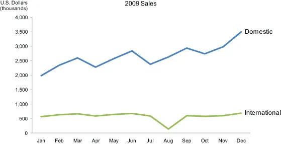
As an example, see the following table. While data is precise and structured, trends and patterns are not obvious at first glance. Looking at the graph representing the same data, you can recognize immediately the ups and downs, and exceptional values.

Pre-attentive processing
As Wikipedia describes:
Pre-attentive processing is the subconscious accumulation of information from the environment. All available information is pre-attentively processed. Then, the brain filters and processes what is important. Information that has the highest salience (a stimulus that stands out the most) or relevance to what a person is thinking about is selected for further and more complete analysis by conscious (attentive) processing.
Visual pre-attentive attributes are attributes that we percept visually, before consciencous attention. It usually takes less than 500 milliseconds for the eye to transmit and for the brain to process such attributes, so it is very fast. Thus, if we understand how it works we can benefit from it and create more effective visualizations.
Certain people have trouble in transition from pre-attentive processing to attentive processing. For example, filtering out less relevant information. For other people with visual impairment it may be impossible to differentiate between values of an attribute, like color.
Does it mean, that looking at the same data visualization, people can come to different conclusions influencing their decision making? Can we take into account those differences and create visualizations that best fit for most of us? In this article I will only touch how color blindness can impact perception of information.
Visual variables
Pre-attentive visual variables resp. attributes are differences between elements, that the human eye can perceive. Such differences include the position, color, size, shape or orientation. Some of them can be ranked higher than others.
How you select and map data record properties to them plays a key role in creating expressive data visualizations. It requires you to know your targeted user group and also some testing.
Now, let’s concentrate on the attribute color.
Color
In color theory, hue, brightness and color saturation belong to the main fundamental characteristics of a color. Hue refers to the property by which color sensations are distinguished according to, for example, red, yellow or green.
A color of the same hue can vary either in color saturation – i.e. the intensity of a hue -, or in brightness. Increasing color saturation can be perceived as incrementing a value. Using heatmaps is an example for that.
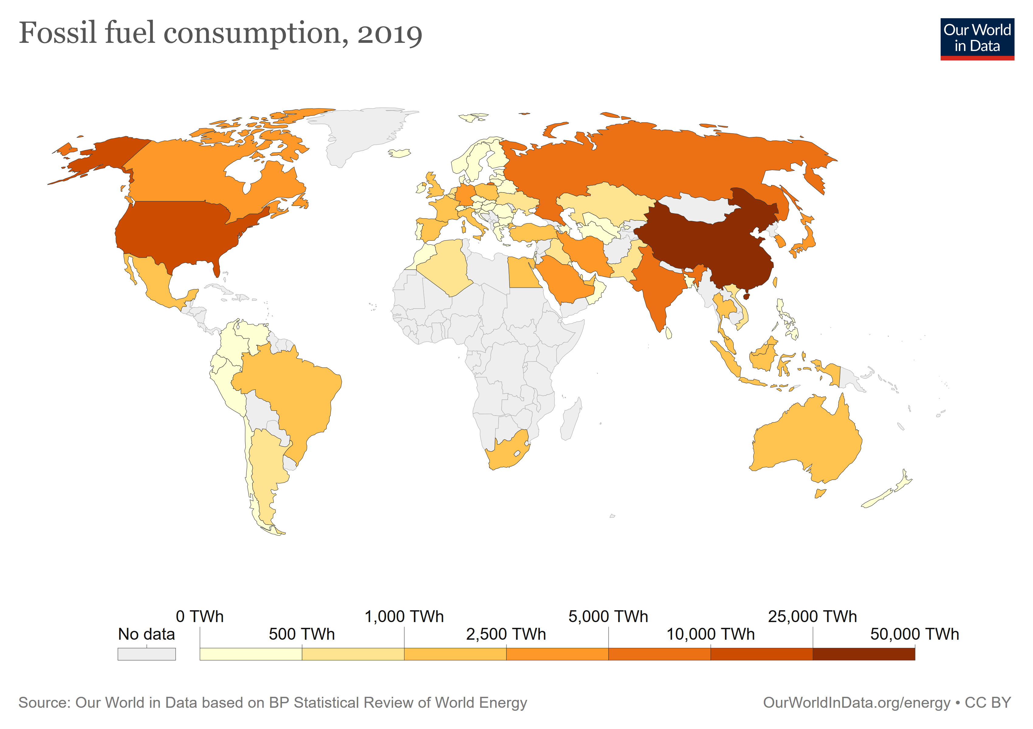
Color perception is also dependent on the context and contrast around that color. It is helpful to use a consistent background. For objects to grasp attention, apply contrasting background colors.
If you look at a visualization that has a complex structure and a lot of details, your attention will focus on the contrasts, this is what you will first see.
Generally, try to use a small level of contrast and apply higher contrast only to differences in meanings.
You can also limit the usage of colors to places where you want to emphasize main elements in your visualization.
For example, apply grey for less important elements and color for important data points you want to direct your users’ attention to.
Grey is also great to show non-selected, non-relevant parts or to make your visualization appear more harmonic. The more colors you use the harder to understand the result.
Color palettes
Choose a meaningful set of colors that best represent your data. Following tools can help you in this:
ColorBrewer: Here, based on the nature of your data, you can experiment with different color schemes. You also get hints on colorblind safety.
Coolors: For putting together your color palette in an interactive manner.
Colorscales: Experiment with palettes.
Visual impairment
Individuals with vision disabilities like color-blindness or low-vision impairment see our content differently. Thus, we have to optimize our data visualization for them and cannot rely on color alone to communicate.
There exist a lot of tools that can help us in this, for example:
TPGi-ColorContrastChecker or WebAIM-Checker
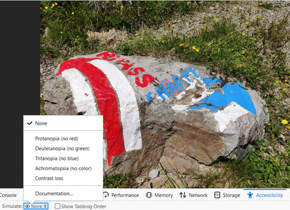
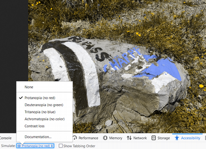
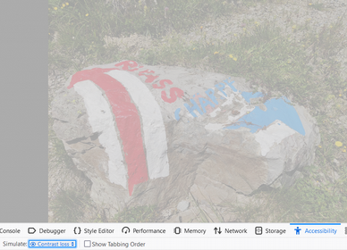
Or take your “Web Developer Toolbar” in your favorite browser and go to the “Accessibility” tab. It offers you the possibility to look through the eyes of a person with visual impairment. Is your data visualization still expressive and understandable? Can you distinguish relevant details? If you care about accessibility, this is one easy method to check for it.
As an example, see following illustrations:
Gestalt Principles
Finally, to give you a broader context, it is worth mentioning some of the Gestalt principles that are relevant in visualizations:
Proximity says that we perceive elements to be related to each other, based on how close they are positioned to each other.
Similarity implies that we group elements intuitively together, if they have similar shapes, colors or sizes.
Enclosure says that we perceive elements to be in the same group if they are represented on a common, distinguished area.
Thus, following these principles, we can reduce cognitive load. And facilitate fast perception of relevant information.
And now?
Try experimenting with different color palettes and check with your audience the results. Go to your browser and verify with some of the tools I mentioned that you are on the right path.
Do you rely on some other methods in your daily work? Please share your experience.
Want to learn more about data visualization?
➤ Download my checklist 10 Steps to Amazing Data Visualizations

